Python総合講座
本講座は2020年まで公開していた「Anti-Pythonian教授によるPython作図講座」をリニューアルし、ある程度、系統的にPythonコードの書き方を解説するものです。
目次
Ⅰ.気象データの出入力
(1) pure binary(俗称Grads)形式の読み書き
(2) pythonの一時保存ファイル.npy形式の読み書き
(3) excelの読み書き
(4) grib形式の読み込み
(5) netcdf形式の読み込み
(6) HTML形式のAmedasデータの読み込み
(7) Wyoming大学のサウンディングデータ(ASCII)の読み込み
(8) 気象庁形式nusdasについて
Ⅱ.描画
(1) 描画カンバス内にパネルを自動割り付け(plt.subplots)
(2) 描画カンバス内にパネルを割り付け(plt.axes)
(3) -(マイナス記号)や℃を出す方法
(4) 日付軸(matplotlib.datesを使う方法と使わない方法)
(5) 等値線(axes.contour)とラベル
(6) 色影によるshading(axes.contourf)とカラーバー
(7) gridmeshに囲まれた部分に色影をつける(plt.pcolormesh)
(8) 棒グラフ
Ⅲ.地図上への描画
(1) ランベルト正角円錐図法
(2) 地図上にベクトルを描く(axes.annotateの濫用)
(3) 都道府県・市町村境界を描く(shapeファイル)
(4) 観測点など緯度経度が斉一な格子点で与えられていないときの描画方法
(5) 座標変換に関する実験
Ⅳ.国土数値情報への描画
(1) 都道府県、支庁(北海道)、市町村境界
Ⅰ.気象データの出入力
(1) 所謂、pure binaryデータの読み込みと書き込みです。データはここからdownloadしてください。気温の気候値です。
このデータはlittle endianですが、big endianの場合はdtype=">f4"とします。
def read_binary_data():
    import numpy as np
    nx, ny, nz, nt, nm = 288, 145, 37, 12, 6
    t = np.memmap("anl_p125_tmp.bin",      # ファイル名
                  dtype = "f4",            # 4バイト浮動小数点型
                  mode = "r",              # "r"は読み込み専用
                  shape = (nz,ny,nx),      # アレイを指定
                  offset = nm*nz*ny*nx*4)  # 読み込み開始位置のバイト数
    return t
t = read_binary_data()
これに続けて、下記を実行すると、バイナリデータとして書き込まれます。
def write_binary_data(t):
    import numpy as np
    nx, ny, nz, nt, nm = 288, 145, 37, 12, 6
    np.memmap("anl_p125_tmp_Jun.bin",  # ファイル名
              dtype = "f4",            # 4バイト浮動小数点型
              mode = "w+",             # "w+"は書き込みのみ
              shape = (nz,ny,nx))[:,:,:] = t[:,:,:] # 左辺の[:,:,:]は必須
    return
write_binary_data(t)
(2) Python「専用」形式への読み書きです。npyは他言語からでも読めますが、pythonでしか見たことがないです。アレイの形が保存されるなど便利なので、
データの仮置きにお薦めです。下記、例では(1)で定義したtを使います。
import numpy as np
np.save("anl_p125_tmp.npy",t)         # ファイルにデータを書く
これに続けて、下記を実行すると、アレイの形が保存されていることがわかります。
import numpy as np
t = np.load("anl_p125_tmp.npy")       # ファイルからデータを読む
print(t.shape)
(3) Excelデータの読み書きです。pandasを使うのが正解です。AMeDASデータをエクセルにしたものと
CSVにしたものを利用します。
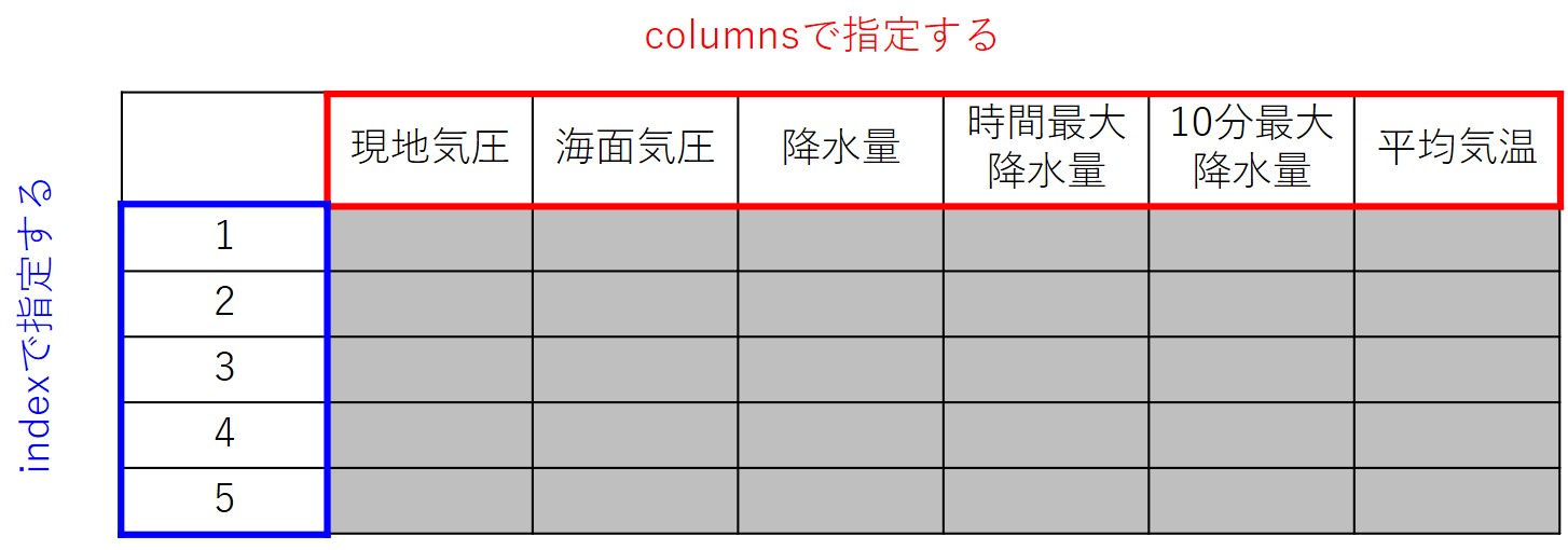
pandasは縦がindex横がcolumnsと呼びます。下図のようなイメージです。
import pandas as pd   # エクセル操作関係はpandasを使う
df = pd.read_excel("Amedas.47412.202001.xlsx", index_col=0) # index_col = 0を書かないとUnnamed: 0というコラムが出てしまう
# df = pd.read_csv("Amedas.47412.202001.csv", index_col=0) # csvも同様に読むことができる
display(df) # displayがエラーになる場合があるらしい
上記に続けて、同じ内容を別のエクセルファイルとして書き出します。
import pandas as pd   # エクセル操作関係はpandasを使う
df.to_excel("test.xlsx") # excelはto_excel
df.to_csv("test.csv")    # csvはto_csvで書き込む
気温の高い順のような整列も簡単にできます。
df1 = df.sort_values("日平均気温") # 昇順(気温が低い方から高い方へ並べる)
df2 = df.sort_values("日平均気温", ascending=False) # 昇順(気温が高い方から低い方へ並べる)
行(index)方向の切り出しと列(column)方向の切り出し。
temp = df["日平均気温"].values # .valuesと書くとDataFrameからアレイに変換できる
print(temp)
day1 = df.iloc[0].values # .iloc[行数]が便利
day1_3 = df.iloc[0:3,0:10].values # .ilocなら[行範囲,列範囲]で範囲指定して切り出すこともできる。
print(df.index)  # indexの値を確認
day1 = df.loc[1] # .ilocに代えてloc[index名]でも可
降水データのように観測ナシに--記号が入っている場合に、欠損値に変換する必要があります。
import numpy as np
undef = -999.0  # 欠損値を設定
crain = df["日降水量"].values # 文字型で読まれている
nrain = len(crain)           # アレイの大きさをnrainとする
rain = np.ones((nrain),dtype="f4") * undef # nrainの大きさの浮動小数点数のアレイを用意し、
                                           # np.onesで1をすべていれておいて、欠損値を乗じて、
                                           # すべて欠損値にしておく
for irain in range(nrain):
    try:
        rain[irain] = float(crain[irain])  # floatに変換できない場合は欠損値のままとなる例外処理
    except:
        pass
風向データを角度に変換し、さらに東西風・南北風に変換するプログラムです。
def wind_to_vector(wdir,wspeed):
    import numpy as np
    undef = -999.9
    cdir = ["北","北北東","北東","東北東","東","東南東","南東","南南東",
            "南","南南西","南西","西南西","西","西北西","北西","北北西"]
    if wdir in cdir:
        angle = cdir.index(wdir) * 22.5        # wdirと完全一致するものを見つけます
        u = -np.sin(angle*np.pi/180) * wspeed  # 北から時計まわりの角度であり
        v = -np.cos(angle*np.pi/180) * wspeed  # 風向が風が「吹き込む」方角であることに注意
    else:                           # wdirが風向を表す文字列ではないときはundefを返す
        u, v = undef, undef
    return u, v
wind_to_vector("西北西",3.0)
wind_to_vector("--",3.0)
(4)) 気象データによくあるgrib(グリブ)形式の読み込みです。気象庁再解析データJRA55もgribで提供されています。 この例はJRA55に特化したものです。
def inquire_grib_data(path):
    import pygrib                  # gribファイルの中身を見たい場合はinquire_grib_data(path)を実行
    grbs = pygrib.open(path)
    for grb in grbs:
        print(grb)
    return
def read_grib_data(path,name=None,level=None):
    import numpy as np
    import pygrib                   # pygribは!pip3 install pygrib --userでインストール
    grbs = pygrib.open(path)

    if name != None:                # anl_surf125に対しては変数名を与える
        alines = grbs.select(name=name)
    elif level != None:             # anl_p125に対しては気圧面を与えるとその水平面データ
        alines = grbs.select(level=level)
    else:                           #                  気圧面を与えないと全3次元データ
        alines = grbs.select()

    lat, lon = alines[0].latlons()  # lonは経度、latは緯度データ: (ny,nx)の2次元格子です
    ny, nx = lat.shape
    nline = len(alines)
    gdata = np.empty( (nline,ny,nx), dtype = "f4" )
    levels = np.empty( (nline), dtype = "f4" )
    for iline, aline in enumerate(alines):
        gdata[iline,:,:] = aline.values[::-1,:]
        levels[iline] = aline["level"]

    return lon, lat[::-1], level, gdata
inquire_grib_data("anl_surf125.2020010100") # これを実行すると、この下のnameに何を与えるかがわかります
lon, lat, _, SLP = read_grib_data("anl_surf125.2020010100",name="Mean sea level pressure")
T850 = read_grib_data("anl_p125_tmp.2020010100",level=850)[3]
(5) 気象データによくあるnetcdf(ネットシーディーエフ)形式の読み込みです。 この例で利用するデータは降水の月平均データGPCPです。
def read_netcdf_data(path):
    import netCDF4                  # netCDF4は!pip3 install netCDF --userでインストール
    import numpy as np
    import datetime as dt           # 日付関係の制御ライブラリ
    nc = netCDF4.Dataset(path, "r")
    var = nc.variables["precip"][:,:,:]  # 格納されているデータ
    lon = nc.variables["lon"][:]         # 経度データ(1次元)
    lat = nc.variables["lat"][:]         # 緯度データ(1次元)
    time = nc.variables["time"][:]       # 時間データ(ただし1800年元日からの日数)
    dtime = [dt.datetime(1800,1,1)+dt.timedelta(days=t) for t in time]
    print(nc.variables.keys())
    print(nc.dimensions.keys())
    nc.close()
    return dtime, lon, lat, var
dtime, lon, lat, prcp = read_netcdf_data("precip.mon.mean.nc")
(6) HTML形式のAMeDASデータの読み込みです。BeautifulSoupを使います。ここでは 2020年1月の札幌の観測値を例に挙げて説明します。まず、HTMLファイルとして、ダウンロードします。過度な自動ダウンロードは先方サーバに負荷を 与えるので、控えてください(つまり下記のプログラムは一回実行すればよく、何度も実行してはいけません)。
def download_amedas_daily(pid,gid,year,month):
    from urllib.request import urlopen
    from bs4 import BeautifulSoup            # !pip3 install bs4 --userでインストール
    path = "https://www.data.jma.go.jp/obd/stats/etrn/view/daily_s1.php?"
    req = "prec_no={0:d}&block_no={1:05d}&year={2:04d}&month={3:02d}&day=&view=p1".format(pid,gid,year,month)
                                             # 文字列.format(変数)で変数に書式を定めて文字列内に反映させる
                                             # {0:d}はpidを整数型で文字にするの意味
                                             # {1:05d}はgidを整数型(zero padding 5桁)で文字にするの意味
    html = urlopen(path+req).read()
    soup = BeautifulSoup(html, 'html.parser')
    with open("Amedas.{0:d}.{1:04d}{2:02d}.html".format(gid,year,month),"w") as fw:
        fw.write(soup.prettify())
    return
download_amedas_daily(14,47412,2020,1) # AMeDASの都道府県名や地点名は実際にウェブページに行くと確認できます。
次に表形式としてpandasデータフレームを通じて、エクセルに書き出します。AMeDASデータは欠損などあるので、とりあえず文字列として保存するのが安全です。
def read_amedas_daily_html(html_file,excel_file):
import numpy as np
import pandas as pd
from urllib.request import urlopen
from bs4 import BeautifulSoup
html = open( html_file, mode = 'r', encoding = 'utf8').read()
soup = BeautifulSoup(html, 'html.parser')
table = soup.find_all("table")[5]
values = [] # リストだと逐次追加が便利で、サイズ未定のときに使いやすい
for itd in range(31):
try: # 小の月はitdが30のところで下記の試みが失敗することを想定して、ここで回避している。
values.append([td.get_text().replace("\n","").replace(" ","") \
for td in table.find_all("td")[itd*21:(itd+1)*21]]) # \は継続行の意味
except:
pass
values = np.array(values) # リストのままだと成分表示が面倒なので、アレイにする
columns=["現地気圧","海面気圧","日降水量","時間最大降水量","10分最大降水量", # AMeDASのウェブページが込み入った表なので
"日平均気温","日最高気温","日最低気温","日平均湿度","日最低湿度", # このように作り直した方がきれいな表になる
"平均風速","最大風速","最大風向","瞬間最大風速","瞬間最大風向",
"日照時間","降雪量","最大積雪深","天気概況(昼)","天気概況(夜)"]
df = pd.DataFrame(values[:,1:],index=values[:,0],columns=columns) # indexは縦、columnsは横
df.to_excel(excel_file)
return
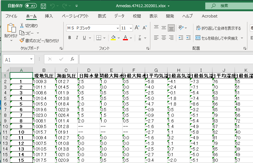
read_amedas_daily_html("Amedas.47412.202001.html","Amedas.47412.202001.xlsx")
この結果、下記のようなエクセルファイルが出力されます。
(7) ワイオミング州立大学のサウンディングデータ(アスキーデータ)を読んでみます。これもpandasに格納するのが美しいですかね。
import numpy as np
import matplotlib.pyplot as plt
import pandas as pd
from urllib.request import urlopen
from bs4 import BeautifulSoup

### この部分は何回も繰り返さないように!
url = "http://weather.uwyo.edu/cgi-bin/sounding?"
req = "region=pac&TYPE=TEXT%3ALIST&YEAR=2021&MONTH=01&FROM=0900&TO=0900&STNM=47412"
soup = BeautifulSoup(urlopen(url+req).read(), 'html.parser')

html = soup.find_all("pre")[0].text.strip().splitlines()  # HTMLを行ごとに文字列リストに格納
print(html)

dat = [[html[1][7*i:7*(i+1)] for i in range(11)]]         # 1行目の文字列をcolumns用に確保
for s in html[4:]:
    dat.append([float(s[7*i:7*(i+1)]) if s[7*i:7*(i+1)].strip()!="" else np.nan for i in range(11)])
    ### 内包表現と呼ばれるもの
    ### X if A else Y はpython的な変な順番だが、もしAが真ならXを実行し、偽ならYを実行するの意味
    ### P for i in range(11)でiを0から10(11じゃない!)までをループする
df = pd.DataFrame(dat[1:],columns=dat[0])
display(df)
こんな感じの出力となります。2021年1月1日9時、札幌における高層気象観測データです。
	PRES 	HGHT 	TEMP 	DWPT 	RELH 	MIXR 	DRCT 	SKNT 	THTA 	THTE 	THTV
0 	1004.0 	26.0 	-6.5 	-13.5 	58.0 	1.35 	250.0 	7.0 	266.4 	270.2 	266.6
1 	1003.0 	31.0 	-6.5 	-13.7 	56.0 	1.33 	260.0 	4.0 	266.5 	270.2 	266.7
2 	1000.0 	46.0 	-6.3 	-14.3 	53.0 	1.27 	265.0 	4.0 	266.9 	270.5 	267.1
3 	926.0 	642.0 	-11.0 	-17.1 	61.0 	1.09 	290.0 	16.0 	267.9 	271.1 	268.1
4 	925.0 	650.0 	-11.1 	-17.1 	61.0 	1.09 	290.0 	16.0 	267.9 	271.1 	268.1
... 	... 	... 	... 	... 	... 	... 	... 	... 	... 	... 	...
77 	20.0 	25970.0 	-41.1 	NaN 	NaN 	NaN 	205.0 	43.0 	709.6 	NaN 	709.6
78 	17.6 	26834.0 	-43.3 	NaN 	NaN 	NaN 	225.0 	41.0 	729.0 	NaN 	729.0
79 	17.0 	27069.0 	-42.8 	NaN 	NaN 	NaN 	230.0 	41.0 	738.0 	NaN 	738.0
80 	16.0 	27478.0 	-41.8 	NaN 	NaN 	NaN 	250.0 	23.0 	754.0 	NaN 	754.0
81 	15.5 	27693.0 	-41.3 	NaN 	NaN 	NaN 	NaN 	NaN 	762.5 	NaN 	762.5
(8) 気象庁で配信する独自形式nusdasの読み込みです。データ書式の本質は、 このマニュアルの付録Aだけで理解できます。
def decode_nusdas(fname):
    import os
    import numpy as np
    import datetime as dt
    from struct import unpack, iter_unpack

    n = os.path.getsize(fname)
    print("file size=", n)

    outs, dtims, levels, elements = [], [], [], []
    dtim_base = dt.datetime(1801,1,1,0,0)  # base datetime counted by minutes

    with open(fname,mode="rb") as f:
        while True:
            n_record, = unpack(">I",f.read(4))  # unsigned integer
            c_header = f.read(4).decode()

            if c_header == "DATA":
                f.seek(20-8,1)
                nt1, = unpack(">I",f.read(4))
                nt2, = unpack(">I",f.read(4))
                c_level = f.read(12).decode()  # lebel name
                c_element = f.read(6).decode() # element name

                dtims.append( dtim_base + dt.timedelta(minutes=nt1) )
                levels.append( c_level )
                elements.append( c_element )

                f.seek(48-46,1)
                nx, = unpack(">I",f.read(4))
                ny, = unpack(">I",f.read(4))

                # only for 2UPC
                c_packing = f.read(4).decode()
                c_missing = f.read(4).decode()
                base = unpack(">f",f.read(4))[0]
                ampl = unpack(">f",f.read(4))[0]
                pack = np.array([i[0] for i in iter_unpack(">H".format(nx*ny), f.read(nx*ny*2) ) ]).reshape(ny,nx)
                outs.append(base + ampl * pack)

                f.seek(6,1)

            elif c_header == "END ":
                break
            else:
                f.seek(n_record,1)

    return outs, dtims, levels, elements

outs, dtims, levels, elements = decode_nusdas("./202303290000")
Ⅱ.描画
(1) pythonでは描画にまつわる座標が複数あり、長さの単位として主にポイント(pt)を使います。1ptは1/72 in(インチ)です。1 inは2.54cmです。
import matplotlib.pyplot as plt       # 描画はmatplotlib.pyplotをimportします。
print(plt.rcParams)                    # あらゆる描画パラメタのdefault値が返ります。
fig, ax = plt.subplots(1,2,            # 縦に1個、横に2個のパネルを配置
                       figsize=(5,2),  # 描画は5inch×2inchの範囲
                       dpi=144)        # 解像度は144 dot per inch
fig.savefig("python/draw2_1.png")      # fig.savefig(画像を保存するファイル)
まず、Figure座標を説明します。描画カンバス全体を横軸(X)と縦軸(Y)で張り、左下端に原点を置きます。端から端までを1と定義して[0,1]x[0,1]の平面がFigure座標です(図の青線)。描画カンバスの大きさはfigsizeで指定します。figsizeは正方である必要がないので、Figure座標はXとYで等長ではありません。図の例だと5inx2inの描画カンバスなので、Xの単位長はYの単位長の2.5倍です。
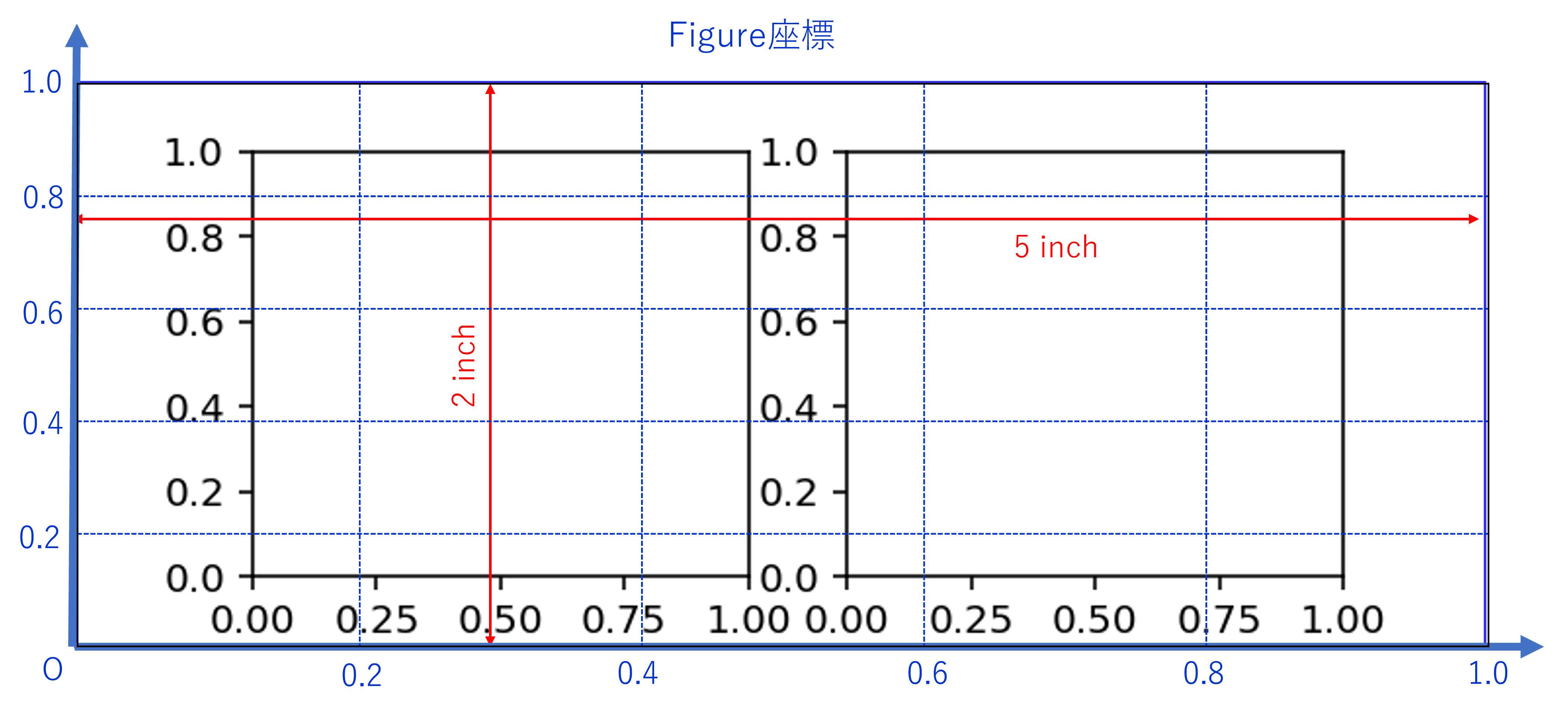
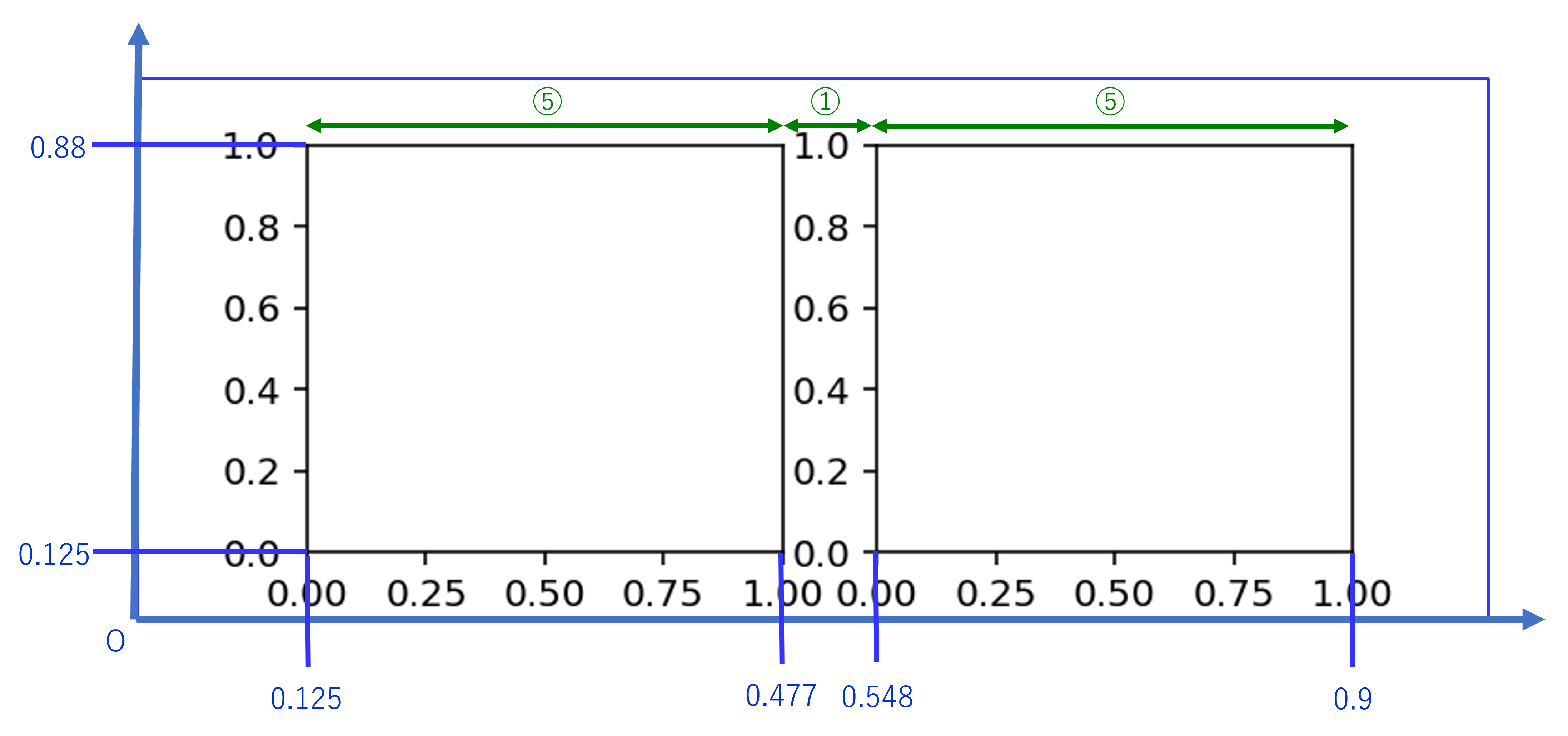
上図も下図もsubplotsで複数個のaxes(パネル)自動生成した例です。描画カンバスに対し、Figure座標で左に0.125、右に0.1、下に0.125、上に0.12を残し、その上でaxesの範囲はラベル用のスペースとパネル用のスペースを1:5に分けるように、スペースを割り当てているみたいです。従って、描画の縦横比、ラベルのサイズによっては、明らかにスペースが足りなくなります。
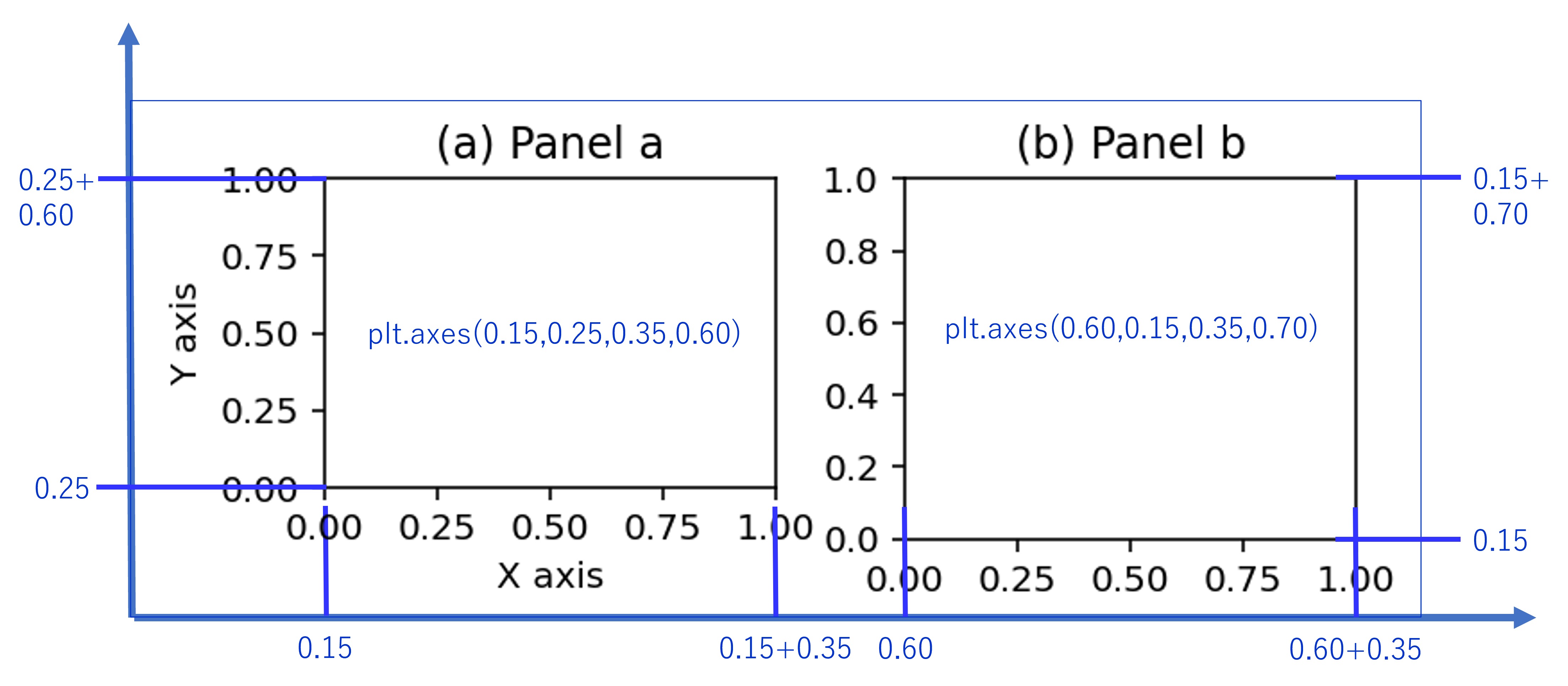
(2) (1)の自動割り付けによる不便を回避するためには、個別にaxes(パネル)の領域をFigure座標でplt.axes()によって、陽に割り当てるとよいです。このときラベルやタイトルを描く範囲は別で、あくまで枠で囲まれた範囲を指定します。これが厄介で目盛り、ラベル、タイトルに何ポイント使うのか、を何となくわかっていないといけません。
個別にパネルの位置を指定する方法です。(1)の自動生成の例だと、Figure座標で0.0705(0.0705x5inx72pt/in=25.3pt)にピッタリラベルがはまっています。デフォルトで目盛り3.5pt、目盛りとラベルの間の余白3.5pt、文字のデフォルトが10ptです。"1.0"で3文字ですが、プロポーショナル・フォントは文字によって横幅が異なります。数字は半分、句読点やi, jなど細長い文字は1/4、文字文字間を1ptと概算すると、10ptの"1.0"の3文字で大体14.5ptで、合計21.5ptです。なお、軸ラベルまでの余白は4pt、図タイトルまでの余白は6pt、軸ラベルの文字は10pt、図タイトルの文字は12ptで計算し、文字の縦幅はフォントサイズと同じと概算できます。
このように内容はごちゃごちゃ書きましたが、目安とする広さは下表の通りです。
| 置くもの | 余白の目安(X) | 余白の目安(Y) |
| 目盛りだけ | 0.1 in (7.2pt) | 0.1 in (7.2pt) |
| 目盛りとラベル | 0.5 in (36pt) | 0.3 in (21pt) |
| 目盛りとラベルと軸タイトル | 0.75 in (54pt) | 0.5 in (36pt) |
| 図タイトル | 0.3 in (21pt) |
上記の数値をfigsizeで定めたinch数で割り算したものが、plt.axesで定めるべき数値です。
import matplotlib.pyplot as plt       # 描画はmatplotlib.pyplotをimportします。
fig = plt.figure(figsize=(5,2),       # 描画カンバスを5inch×2inchで用意します。
                 dpi=144)             # 解像度は144 dot per inch
ax1 = plt.axes((0.15,0.25,0.35,0.60)) # axes(パネル)の枠領域を設定します。
ax2 = plt.axes((0.60,0.15,0.35,0.70)) # (左,下,横幅,縦幅)をFigure座標で定義します。
ax1.set_xlabel("X axis")              # ax1(左のパネル)にX軸ラベルを書く
ax1.set_ylabel("Y axis")              # ax1(左のパネル)にY軸ラベルを書く
ax1.set_title("(a) Panel a")          # ax1(左のパネル)の上部にタイトルを書く
ax2.set_title("(b) Panel b")          # ax2(右のパネル)の上部にタイトルを書く
fig.savefig("python/draw2_2.png")      # fig.savefig(画像を保存するファイル)
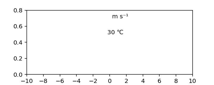
(3) 特殊文字あれこれ。SI単位系ではm/sよりもm s-1を推奨しています。また、気象学では℃や°の記号を多用します。さらに-(マイナス)記号がデフォルトだと-(ハイフン)となってしまいます。このような不便を解消するため、unicodeを指定します。
import matplotlib.pyplot as plt       # 描画はmatplotlib.pyplotをimportします。
fig, ax = plt.subplots(1,1,figsize=(5,2),dpi=144)
ax.set_xlim(-10,10)                  # x軸の範囲を-1~1にする
ax.set_ylim(0,0.8)                 # y軸の範囲を0~0.2にする
ax.set_xticks(np.arange(-10,12,2)) # x軸の目盛りを-10, -8, -6, ..., 6, 8, 10
ax.text(0.3,0.7,"m s\u207B\u00B9") # 0.3,0.7の場所に m s^-1と描く
ax.text(-0.3,0.5,"30 \u2103")       # 0.3,0.5の場所に 30 ℃と描く
fig.savefig("python/draw3_1.png")      # fig.savefig(画像を保存するファイル)
よく使うunicodeは下表の通りです。
| 記号 | unicode | 記号 | unicode |
| 1 | u00B9 | 1 | u2081 |
| 2 | u00B2 | 2 | u2082 |
| 3 | u00B3 | 3 | u2083 |
| − | u207B | − | u2212 |
| ℃ | u2103 | ° | u00B0 |
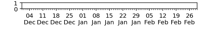
(4) 日付軸はdatetimeとmatplotlib.datesを使います。実例を示すだけで十分でしょう。一つ目の例はmatplotlib.datesを使って、1週間おきの日付軸を描いたもの。
import datetime as dt                                      # 日付を扱うライブラリ
import matplotlib.pyplot as plt
import matplotlib.dates as mdates                          # 日付を描画するライブラリ
fig = plt.figure(figsize=(5,0.7),dpi=144)
ax = plt.axes((0.1,0.7,0.8,0.2))
ax.set_xlim(dt.datetime(2000,11,30),dt.datetime(2001,3,2))  # dt.datetime(年,月,日,時)
ax.xaxis.set_minor_locator(mdates.DayLocator(interval=1))   # 小目盛りを1日おき
ax.xaxis.set_major_locator(mdates.DayLocator(interval=7))   # 大目盛りを7日おき
ax.xaxis.set_major_formatter(mdates.DateFormatter('%d\n%b'))# 大目盛りのラベルの書式%dは日, %bはJanなど英字3文字
fig.savefig("python/draw3_2.png")      # fig.savefig(画像を保存するファイル)
matplotlib.datesを使わない例。6時間おきの日付軸を描いたもの。
import datetime as dt
import matplotlib.pyplot as plt
dts = [dt.datetime(2000,10,7)+dt.timedelta(hours=i) for i in range(49)] # [for i in range()]でリストを作るのは内包表現という
print(dts[::6])
lab = [dt0.strftime("%H:00") for dt0 in dts[::6]]   # labelを自分で作成。dt.strftime("%Y%m%d %H:%M")でdtから日付文字に変換
lab[::4] = [dt0.strftime("%H:00\n%d %b") for dt0 in dts[::24]]
fig = plt.figure(figsize=(5,0.7),dpi=144)
ax = plt.axes((0.1,0.7,0.8,0.2))
ax.set_xlim(dts[0],dts[-1])  # 日付の範囲:dts[-1]はリストの末尾を意味する
ax.set_xticks(dts[::6])      # set_xticksで目盛りの位置を指定
ax.set_xticks(dts,minor=True)#  minor=Trueで小目盛りを指定
ax.set_xticklabels(lab)      # set_xticklabelsで目盛りのラベルを指定
fig.savefig("python/draw3_3.png")      # fig.savefig(画像を保存するファイル)
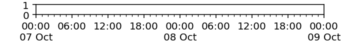
内包表現によって得られたリストは下記の通り。[::6]は6個飛ばしで出力を意味します。
[datetime.datetime(2000, 10, 7, 0, 0), datetime.datetime(2000, 10, 7, 6, 0), datetime.datetime(2000, 10, 7, 12, 0), datetime.datetime(2000, 10, 7, 18, 0), datetime.datetime(2000, 10, 8, 0, 0), datetime.datetime(2000, 10, 8, 6, 0), datetime.datetime(2000, 10, 8, 12, 0), datetime.datetime(2000, 10, 8, 18, 0), datetime.datetime(2000, 10, 9, 0, 0)]
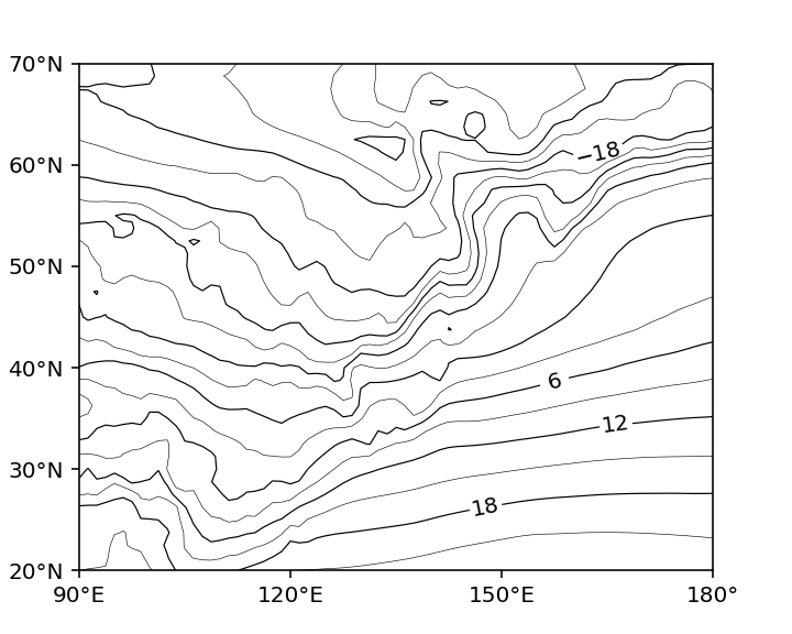
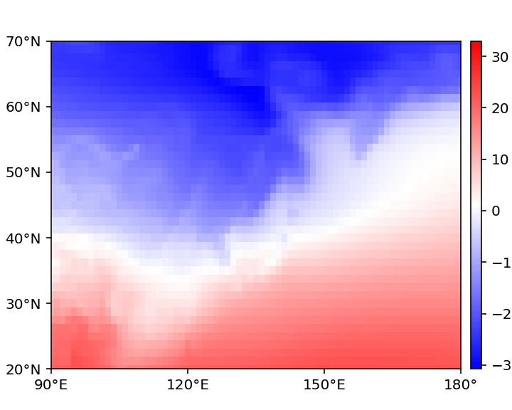
(5) ax.contourで等値線を描けます。単にax.contour(x,y,data)でよいが、細かい設定は下の例を参考にするとよい。等値線にラベルを付けるのはax.clabel()だが、これも大概、デフォルトでは上手くいかない。inline_spacingを調整する必要がある。フォーマットを定めたい場合はfmt="%3d"のようにする。
import numpy as np
import matplotlib.pyplot as plt
nx, ny = 288, 145
lon = np.linspace(0,360,nx,endpoint=False)  # 経度グリッド 0.0, 1.25, 2.5, ..., 358.75
lat = np.linspace(-90,90,ny,endpoint=True)  # 緯度グリッド-90.0, -88.75, ..., 90.0
tmp = np.memmap("python/anl_p125_tmp.bin",dtype="f4",mode="r",shape=(ny,nx))
fig = plt.figure(figsize=(5,4),dpi=144)
ax = plt.axes((0.1,0.1,0.8,0.8))

# 等値線を書くだけなら、下記1行だけでよい、levelsにリストかアレイで等値線を引く値を与える
C = ax.contour(lon,lat,tmp-273.15,levels=np.arange(-33,33,6),colors="k",linewidths=0.3,linestyles="-")

# 以下は等値線にラベルを加えるために試行錯誤しているところ。本来はclabelでよいが、それだと大概スペースが不細工になる。
C1 = ax.contour(lon,lat,tmp-273.15,levels=[-30,-24,-18,-12],colors="k",linewidths=0.6,linestyles="-")
ax.clabel(C1,inline_spacing=-15)
C2 = ax.contour(lon,lat,tmp-273.15,levels=[-6,12,18,24,30],colors="k",linewidths=0.6,linestyles="-")
ax.clabel(C2,inline_spacing=-9)
C3 = ax.contour(lon,lat,tmp-273.15,levels=[0,6],colors="k",linewidths=0.6,linestyles="-")
ax.clabel(C3,inline_spacing=-3)

# 以下は描画範囲と目盛りと目盛りラベルを書く
ax.set_xlim(90,180)
ax.set_xticks(np.arange(90,210,30))
ax.set_xticklabels(["90\u00B0E","120\u00B0E","150\u00B0E","180\u00B0"])
ax.set_ylim(20,70)
ax.set_yticks(np.arange(20,80,10))
ax.set_yticklabels(["20\u00B0N","30\u00B0N","40\u00B0N","50\u00B0N","60\u00B0N","70\u00B0N"])

fig.savefig("contour.png")
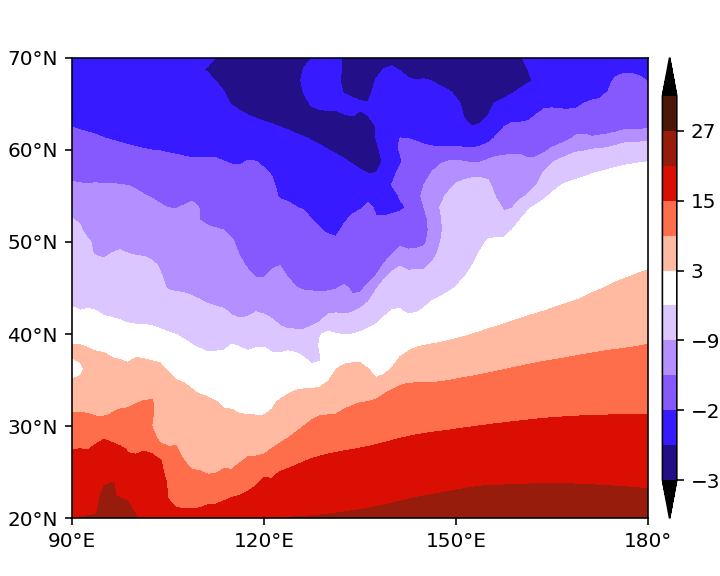
(6) ax.contourfで陰影図を描けます。単にax.contourf(x,y,data)でよいが、細かい設定は下の例を参考にするとよい。 カラーバーはplt.colorbar(C)だが、cax=plt.axes(())によってカラーバーの位置を定めるとよい。カラーバーがデフォルトだと、両端の長さの塩梅が悪いので、extendfracを指定するとよい。
import numpy as np
import matplotlib.pyplot as plt
nx, ny = 288, 145
lon = np.linspace(0,360,nx,endpoint=False)  # 経度グリッド 0.0, 1.25, 2.5, ..., 358.75
lat = np.linspace(-90,90,ny,endpoint=True)  # 緯度グリッド-90.0, -88.75, ..., 90.0
tmp = np.memmap("python/anl_p125_tmp.bin",dtype="f4",mode="r",shape=(ny,nx))
fig = plt.figure(figsize=(5,4),dpi=144)
ax = plt.axes((0.1,0.1,0.8,0.8))

# shadingだけなら、下記1行だけでよい、levelsにリストかアレイで等値線を引く値を与える
colors = ["#000000","#231088","#371aff","#8659ff","#b48fff","#dcc6ff","#ffffff",
          "#ffbaa1","#ff6e4a","#da0e03","#971c0b","#4c1709","#000000"]
C = ax.contourf(lon,lat,tmp-273.15,
                levels=np.arange(-33,39,6),  # 色を値で区分して塗分けるときのn+1個の値
                colors=colors,               # 塗りわける色(extend="both"ならn+2個、そうれなければn個)
                extend="both")               # levelの小さい端と大きな端をはみ出した値を入れるならextend="both"を指定
plt.colorbar(C,cax=plt.axes((0.92,0.1,0.02,0.8)),extendfrac=0.1)

# 以下は描画範囲と目盛りと目盛りラベルを書く
ax.set_xlim(90,180)
ax.set_xticks(np.arange(90,210,30))
ax.set_xticklabels(["90\u00B0E","120\u00B0E","150\u00B0E","180\u00B0"])
ax.set_ylim(20,70)
ax.set_yticks(np.arange(20,80,10))
ax.set_yticklabels(["20\u00B0N","30\u00B0N","40\u00B0N","50\u00B0N","60\u00B0N","70\u00B0N"])

fig.savefig("contourf.png")
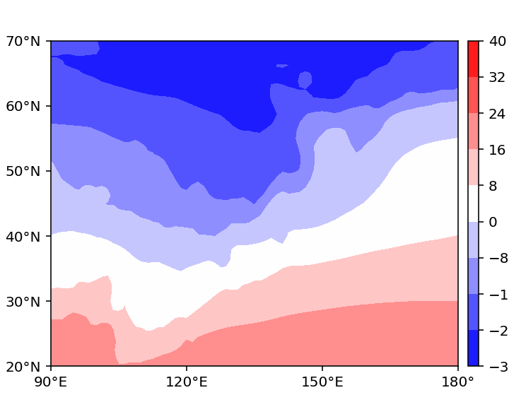
cmapを使うと、上記の色指定部分を省略できます。cmapはこのページなど参考になるでしょう。
import numpy as np
import matplotlib.pyplot as plt
nx, ny = 288, 145
lon = np.linspace(0,360,nx,endpoint=False)  # 経度グリッド 0.0, 1.25, 2.5, ..., 358.75
lat = np.linspace(-90,90,ny,endpoint=True)  # 緯度グリッド-90.0, -88.75, ..., 90.0
tmp = np.memmap("python/anl_p125_tmp.bin",dtype="f4",mode="r",shape=(ny,nx))
fig = plt.figure(figsize=(5,4),dpi=144)
ax = plt.axes((0.1,0.1,0.8,0.8))

# shadingだけなら、下記1行だけでよい、こちらは色を指定しない方法
C = ax.contourf(lon,lat,tmp-273.15,cmap="bwr")
plt.colorbar(C,cax=plt.axes((0.92,0.1,0.02,0.8)),extendfrac=0.1)

# 以下は描画範囲と目盛りと目盛りラベルを書く
ax.set_xlim(90,180)
ax.set_xticks(np.arange(90,210,30))
ax.set_xticklabels(["90\u00B0E","120\u00B0E","150\u00B0E","180\u00B0"])
ax.set_ylim(20,70)
ax.set_yticks(np.arange(20,80,10))
ax.set_yticklabels(["20\u00B0N","30\u00B0N","40\u00B0N","50\u00B0N","60\u00B0N","70\u00B0N"])

fig.savefig("contourf2.png")
(7) ax.pcolormeshでは格子に囲まれた範囲に色付けをします。pcolormeshでは色付けが連続的なので、gradationになります。格子情報ではなく格子点を囲む線をxとyに与えなければならない点が注意です。
import numpy as np
import matplotlib.pyplot as plt
nx, ny = 288, 145
lon = np.linspace(0,360,nx+1,endpoint=True)-1.25/2  # 経度グリッド 0.0, 1.25, 2.5, ..., 358.75の間
lat = np.linspace(-90,90+1.25,ny+1,endpoint=True)-1.25/2  # 緯度グリッド-90.0, -88.75, ..., 90.0の間
print(lon)
print(lat)
tmp = np.memmap("python/anl_p125_tmp.bin",dtype="f4",mode="r",shape=(ny,nx))
fig = plt.figure(figsize=(5,4),dpi=144)
ax = plt.axes((0.1,0.1,0.8,0.8))

# shadingだけなら、下記1行だけでよい、こちらは色を指定しない方法
C = ax.pcolormesh(lon,lat,tmp-273.15,cmap="bwr")
plt.colorbar(C,cax=plt.axes((0.92,0.1,0.02,0.8)),extendfrac=0.1)

# 以下は描画範囲と目盛りと目盛りラベルを書く
ax.set_xlim(90,180)
ax.set_xticks(np.arange(90,210,30))
ax.set_xticklabels(["90\u00B0E","120\u00B0E","150\u00B0E","180\u00B0"])
ax.set_ylim(20,70)
ax.set_yticks(np.arange(20,80,10))
ax.set_yticklabels(["20\u00B0N","30\u00B0N","40\u00B0N","50\u00B0N","60\u00B0N","70\u00B0N"])

fig.savefig("pcolormesh.png")
ax.pcolormeshでもax.contourfのように離散的な色付けにしたい場合は、matplotlib.colorsのfrom_levels_and_colorsでcmapとnormを作成すればよいです。
import numpy as np
import matplotlib.pyplot as plt

nx, ny = 288, 145
lon = np.linspace(0,360,nx+1,endpoint=True)-1.25/2  # 経度グリッド 0.0, 1.25, 2.5, ..., 358.75の間
lat = np.linspace(-90,90+1.25,ny+1,endpoint=True)-1.25/2  # 緯度グリッド-90.0, -88.75, ..., 90.0の間
tmp = np.memmap("python/anl_p125_tmp.bin",dtype="f4",mode="r",shape=(ny,nx))
fig = plt.figure(figsize=(5,4),dpi=144)
ax = plt.axes((0.1,0.1,0.8,0.8))

# pcolormeshでも連続的な色付けにしたくない場合の措置
from matplotlib.colors import from_levels_and_colors
colors = ["#000000","#231088","#371aff","#8659ff","#b48fff","#dcc6ff","#ffffff",
          "#ffbaa1","#ff6e4a","#da0e03","#971c0b","#4c1709","#000000"]
levels = np.arange(-33,39,6)
cmap, norm = from_levels_and_colors(levels,colors,extend="both")

C = ax.pcolormesh(lon,lat,tmp-273.15,cmap=cmap,norm=norm)
plt.colorbar(C,cax=plt.axes((0.92,0.1,0.02,0.8)),extendfrac=0.1)

# 以下は描画範囲と目盛りと目盛りラベルを書く
ax.set_xlim(90,180)
ax.set_xticks(np.arange(90,210,30))
ax.set_xticklabels(["90\u00B0E","120\u00B0E","150\u00B0E","180\u00B0"])
ax.set_ylim(20,70)
ax.set_yticks(np.arange(20,80,10))
ax.set_yticklabels(["20\u00B0N","30\u00B0N","40\u00B0N","50\u00B0N","60\u00B0N","70\u00B0N"])

fig.savefig("pcolormesh2.png")

(8) 棒グラフ
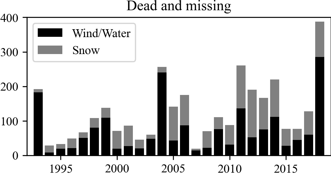
自然災害が多いこの世、風水害と雪害とで死者・行方不明者が同程度であることがわかります、という図の書き方です。内閣府から令和2年度防災白書に付随したエクセルファイルをダウンロードします。
def draw_bar_graph():
    import numpy as np
    import matplotlib.pyplot as plt
    import pandas as pd # excelファイルはpandasで処理するのがやりやすい
    bousai_csv = "http://www.bousai.go.jp/kaigirep/hakusho/r02/csv/siryo08.csv"
    dead_miss_number = pd.read_csv(bousai_csv,header=1,encoding="shift-jis")

    dead_wind = dead_miss_number.iloc[:26,1].values  # .valuesで値をたぶんarrayで返す
    dead_snow = dead_miss_number.iloc[:26,4].values  # .iloc(line,column)で指定できる(便利!)
    time = np.arange(1993,2019) # 1993,2019-1までの1刻みの数列

    fig = plt.figure(figsize=(11/2.54,5/2.54),dpi=300)  # figure領域を 11cm x 5cm に指定
    ax = plt.axes((0.1,0.1,0.8,0.8))                    # axes領域を0.1-0.9, 0.1-0.9に指定

    p1 = ax.bar(time, dead_wind, color="k")
    p2 = ax.bar(time, dead_snow, bottom=dead_wind, color="gray") # 棒グラフに乗せる
    ax.legend((p1[0], p2[0]), ("Wind/Water", "Snow"))   # 凡例をつける

    ax.set_xlim([time[0]-1,time[-1]+1])  # X軸の範囲指定
    ax.set_ylim([0,400])                 # Y軸の範囲指定
    ax.set_title("Dead and missing")     # タイトル

    plt.savefig("Bar_graph.jpg",bbox_inches="tight",pad_inches=0)  # jpegで保存
    fig.show()

    return
draw_bar_graph()
完成した図はこのような感じです。
Ⅲ.地図上への描画
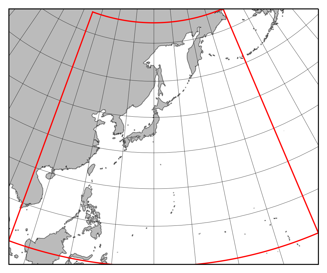
(1) 天気図っぽいランベルト正角円錐図法。規準となる緯度経度の情報が不明なので、気象庁の天気図っぽくなるように適当に与えています。
axes.set_extentで指定するようですが、この範囲が何を表しているのかわからず、場当たり的に指定するしかないかもしれません。
figure座標から緯度経度座標への変換とその逆もコードに書きました。図法によって縦横比が決まっているので、後にfigsizeをぴったりはまるように指定し直すと、
無駄な余白がなくなります。
# figure座標: axesで指定した範囲を(0,1)x(0,1)とする座標
# pixel座標: plt.figureで指定した大きさxDPIに合わせ、左下を原点とするpixelで測った座標
# 距離座標: 地図投影における中心を原点とし、距離で測った座標
# 緯度経度座標
### ここではfigure座標から緯度経度座標へと変換しています ###
def transform_figure_to_lonlat(p_on_fig,ax,proj,proj_cart,flush):
    transform = proj_cart._as_mpl_transform(ax)
    p_on_pix = ax.transAxes.transform(p_on_fig) # figure座標-->pixel座標
    p_on_dis = ax.transData.inverted().transform(p_on_pix)# pixel座標-->距離座標
    p_on_lonlat = proj_cart.transform_point(*p_on_dis, src_crs=proj)# 距離座標-->緯度経度座標
    if flush:
        print("\nFigure coordinate:(A,B)=({0:6.3f},{1:6.3f})".format(*p_on_fig))
        print("Pixel  coordinate:(W,H)=({0:6.1f}px,{1:6.1f}px)".format(*p_on_pix))
        print("Distance coordinate:(X,Y)=({0:8.1f}km,{1:8.1f}km)".format(*p_on_dis/1000))
        print("Lon/Lat coordinate:(λ,φ)=({0:6.1f}deg,{1:6.1f}deg)".format(*p_on_lonlat))
    return p_on_lonlat, p_on_dis, p_on_pix

### ここでは緯度経度座標からfigure座標へと変換しています ###
def transform_lonlat_to_figure(p_on_lonlat,ax,proj,proj_cart,flush):
    transform = proj_cart._as_mpl_transform(ax)
    p_on_dis = proj.transform_point(*p_on_lonlat,proj_cart)# 距離座標<--緯度経度座標
    p_on_pix = ax.transData.transform(p_on_dis)# pixel座標<--距離座標
    p_on_fig = ax.transAxes.inverted().transform(p_on_pix)# figure座標<--pixel座標
    if flush:
        print("\nLon/Lat coordinate:(λ,φ)=({0:6.1f}deg,{1:6.1f}deg)".format(*p_on_lonlat))
        print("Distance coordinate:(X,Y)=({0:8.1f}km,{1:8.1f}km)".format(p_on_dis[0]/1000,p_on_dis[1]/1000))
        print("Pixel  coordinate:(W,H)=({0:6.1f}px,{1:6.1f}px)".format(*p_on_pix))
        print("Figure coordinate:(A,B)=({0:6.3f},{1:6.3f})".format(*p_on_fig))
    return p_on_fig, p_on_pix, p_on_dis

def draw_synoptic_chart(ax_range):   # このルーチンは天気図っぽい地図を書くためのものです。
    import numpy as np
    import matplotlib.pyplot as plt
    import matplotlib.ticker as mticker
    import cartopy.crs as ccrs             # !pip3 install cartopy --userでインストール
    import cartopy.feature as cfeature     # cartopyはprojが最新でないと入らないなど入れるのは難しい

    proj = ccrs.LambertConformal(central_longitude=140,     # ランベルト正角図法の中心経度
                                 central_latitude=35,       # 同中心緯度
                                 standard_parallels=(25,45))# 同標準緯度2本
    proj_cart = ccrs.PlateCarree()

    ax = plt.axes(ax_range,projection=proj)               # projection=projで図法指定

# 赤枠の範囲が収まるように指定している。
    ax.set_extent([105,180,0,65],crs=proj_cart)

# もしも東西5000km, 南北4000kmの範囲を指定したい場合は、上に代えて下記と指定する。
#     ax.set_xlim([-5e6,5e6])
#     ax.set_ylim([-4e6,4e6])

    ax.coastlines(resolution='50m',linewidth=0.2)    # 海岸線を書く
    ax.add_feature(cfeature.LAND.with_scale('50m'), color='#bbbbbb') # 陸を塗潰す
    g = ax.gridlines(crs=proj_cart, linewidth=0.2,color="k")  # 緯経線を書く
    g.xlocator = mticker.FixedLocator(np.arange(-180,190,10)) # 経線は10度ごと(書かない範囲をむやみに指定しない)
    g.ylocator = mticker.FixedLocator(np.arange(-10,80,10))    # 緯線は10度ごと

    return ax, proj, proj_cart

def draw_synoptic_chart_example():
    import matplotlib.pyplot as plt
    fig = plt.figure(figsize=(105/25.4,74.2/25.4),dpi=300)  # figsizeはinch指定なのでmm/25.4する
    ax, proj, proj_cart = draw_synoptic_chart((0,0,1,1))
    for p_on_fig in [(0,0),(1,1)]:
        _, _, _ = transform_figure_to_lonlat(p_on_fig,ax,proj,proj_cart,True) # 戻り値不要なら_にするお約束
    for p_on_lonlat in [(120,20),(160,60)]:
        _, _, _ = transform_lonlat_to_figure(p_on_lonlat,ax,proj,proj_cart,True)

    import numpy as np
    ax.plot(np.arange(105,181,1),0*np.ones((76)),color="r",lw=1,transform=proj_cart)
    ax.plot(np.arange(105,181,1),65*np.ones((76)),color="r",lw=1,transform=proj_cart)
    ax.plot(105*np.ones((66)),np.arange(0,66,1),color="r",lw=1,transform=proj_cart)
    ax.plot(180*np.ones((66)),np.arange(0,66,1),color="r",lw=1,transform=proj_cart)

    fig.savefig("synoptic_chart.png",bbox_inches="tight",pad_inches=0.1)
    return
draw_synoptic_chart_example()
出力を抜粋します。この出力から図の縦横比は1240.2:876.4であることがわかります。
Figure coordinate:(A,B)=( 0.000, 0.000)
Pixel  coordinate:(W,H)=(   0.0px,   0.0px)
Distance coordinate:(X,Y)=( -4480.8km, -3984.5km)
Lon/Lat coordinate:(λ,φ)=( 106.8deg,  -5.1deg)

Figure coordinate:(A,B)=( 1.000, 1.000)
Pixel  coordinate:(W,H)=(1240.2px, 876.4px)
Distance coordinate:(X,Y)=(  5088.3km,  4069.0km)
Lon/Lat coordinate:(λ,φ)=(-139.7deg,  52.0deg)

Lon/Lat coordinate:(λ,φ)=( 120.0deg,  20.0deg)
Distance coordinate:(X,Y)=( -2117.0km, -1442.2km)
Pixel  coordinate:(W,H)=( 306.3px, 276.7px)
Figure coordinate:(A,B)=( 0.247, 0.316)

Lon/Lat coordinate:(λ,φ)=( 160.0deg,  60.0deg)
Distance coordinate:(X,Y)=(  1219.2km,  2958.4km)
Pixel  coordinate:(W,H)=( 738.7px, 755.5px)
Figure coordinate:(A,B)=( 0.596, 0.862)
完成した図はこのような感じです。
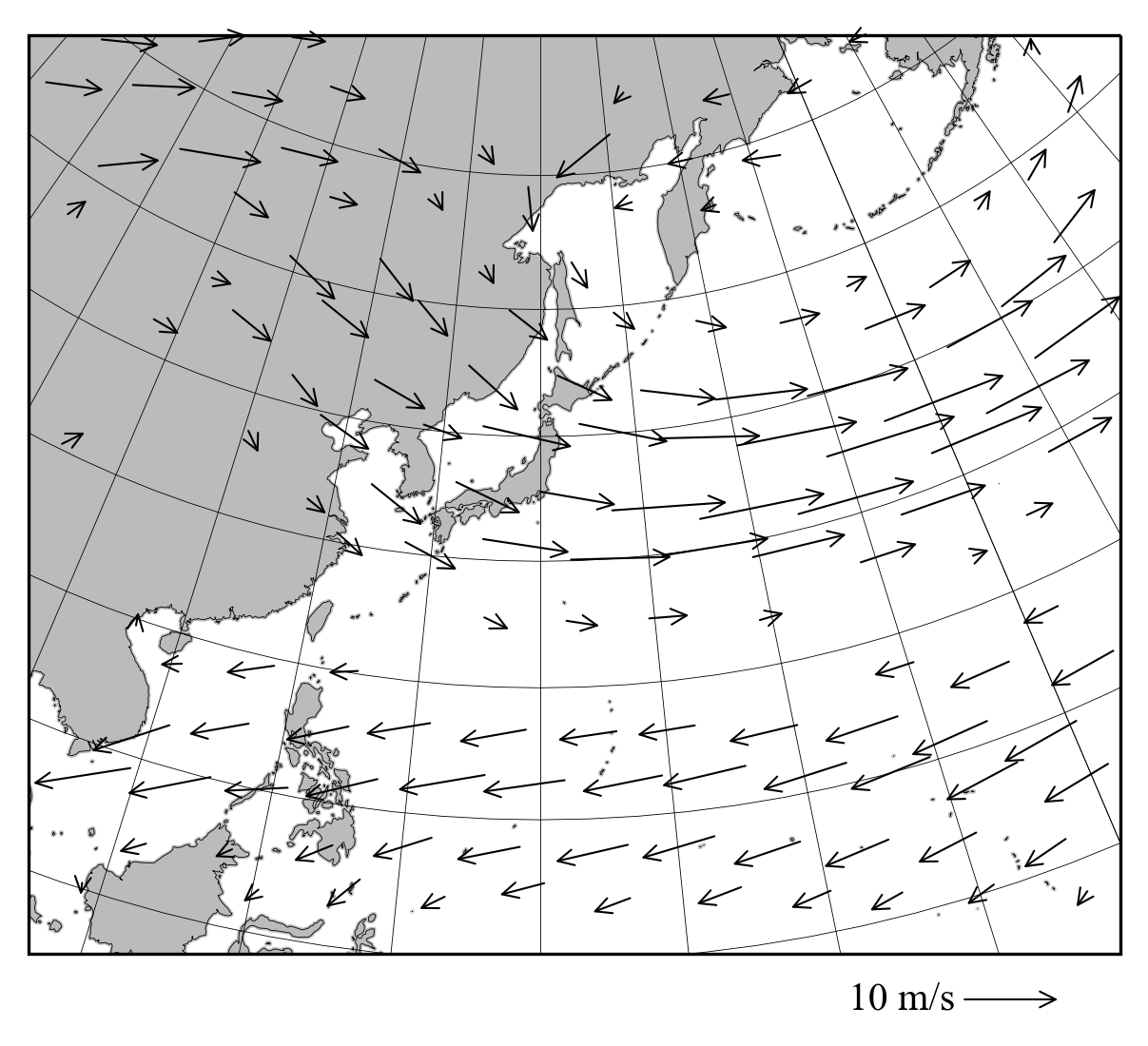
(2) ベクトル図をなるべく等間隔にはっきり描く。axes.quiverは見にくいので、仕方がないからaxes.annotateを「濫用」します。
東西風と
南北風のデータ(気候値です)をダウンロードしてください。
###  矢印を書くのは千鳥格子(正方形の頂点および対角線の交点からなる模様)のような方が矢印が干渉しずらくてよいので
### この関数ではそれを定義します。
def stagger(m,n):
    import numpy as np
    px, py = [], []
    for kax in [0,0.05]:
        for jax in np.arange(1/float(2*n)+kax,1,1/float(n)):
            for iax in np.arange(1/float(2*m)+kax,1,1/float(m)):
                px.append(iax)
                py.append(jax)
    return px, py

### 指定された格子上の点にベクトルをプロットします。
def plot_vectors(ax,proj,proj_cart,    # cartopyを使って定義したもの(synoptic_chart参照)
                px,py,                # figure座標におけるベクトルを書く場所
                x,y,u,v,              # 緯度経度座標で定義された(x,y)と(u,v)
                factor,               # figure座標でよい塩梅になるように長さを調整する
                ulimit):              # ベクトルを書く長さの下限(これ以下の風速はmask out)
    import numpy as np
    import math
    for iax, jax in zip(px,py):
        p_a = (iax,jax)               # 与えられたfigure座標におけるplot位置
        lon, lat = transform_figure_to_lonlat(p_a,ax,proj,proj_cart,False)[0]
                                      # figure座標の位置を緯度経度に変換
        ix = np.argmin(np.abs(x-lon%360))  # その緯度経度に近いデータ点を探索
        iy = np.argmin(np.abs(y-lat))      # データ点座標indexを(ix,iy)とする
        q_a = transform_lonlat_to_figure((x[ix],y[iy]),ax,proj,proj_cart,False)[0]
                                      # 緯度経度(x[ix],y[iy])点をfigure座標に変換(ほぼp_aと同じはず)
        R1 = transform_figure_to_lonlat((q_a[0]-0.01,q_a[1]),ax,proj,proj_cart,False)[0]
        R2 = transform_figure_to_lonlat((q_a[0]+0.01,q_a[1]),ax,proj,proj_cart,False)[0]
                                      # figure座標点は東西南北の方向が左右上下とは異なるので
                                      # figure座標位置の東西方向が緯度経度座標の東西方向から
                                      # どのくらいずれているかを確認
        angle = math.atan2(R2[1]-R1[1],R2[0]%360-R1[0]%360)  # 上記を角度に変換

        U = u[iy,ix] / 2 * factor
        V = v[iy,ix] / 2 * factor
        uabs = np.sqrt(u[iy,ix]*u[iy,ix]+v[iy,ix]*v[iy,ix])  # 風速の計算

        if uabs >= ulimit:
            U, V = U * np.cos(angle) + V * np.sin(angle), -U * np.sin(angle) + V *np.cos(angle)
                                         # U, Vを上記で計算したangleで回転変換(U,V=をばらして2行で書いてはいけない)
            x1, y1 = q_a[0] - U, q_a[1] - V
            x2, y2 = q_a[0] + U, q_a[1] + V
            ax.annotate("",xy=(x2,y2),   # ベクトルの終点
                        xytext=(x1,y1),  # ベクトルの始点(annotateは矢印を積極的に書く目的ではないので、こんな仕様に)
                        xycoords="axes fraction", # figure座標で書くの意味
                        arrowprops=dict(arrowstyle="->", lw=0.5, color="k",
						shrinkA=0,shrinkB=0))  # これがないと始点・終点が2ptだけ短くなる
    return

def plot_unit_vector(ax,proj,proj_cart,
                     px,py,              #参照ベクトルの位置(figure座標)
                     u,v,factor,         #参照ベクトルの大きさ
                     px_text,py_text,    #参照ベクトルに添える注意書きの場所(figure座標, py_textは負値許容)
                     title):             #参照ベクトルに添える注意書き
    u = u/2*factor
    v = v/2*factor
    x1, y1 = px - u, py - v
    x2, y2 = px + u, py + v
    ax.annotate("",xy=(x2,y2),xytext=(x1,y1),xycoords="axes fraction",
                 arrowprops=dict(arrowstyle="->", lw=0.5, color="k",shrinkA=0,shrinkB=0))
    ax.text( px_text, py_text, title, transform=ax.transAxes, ha = "center", va = "center" )

    return

def plot_vector_example():
    import numpy as np
    import matplotlib.pyplot as plt

    # 東西風と南北風を読み込む
    nx, ny, nz = 288, 145, 37
    x = np.linspace(0,360,nx,endpoint=False)
    y = np.linspace(-90,90,ny,endpoint=True)
    u = np.memmap("anl_p125_ugrd.bin", dtype = "f4", mode = "r", shape = (nz,ny,nx) )[6]
    v = np.memmap("anl_p125_vgrd.bin", dtype = "f4", mode = "r", shape = (nz,ny,nx) )[6]

    fig = plt.figure(figsize=(110/25.4,81.8/25.4),dpi=300)  # figsizeはinch指定なのでmm/25.4する
    ax, proj, proj_cart = draw_synoptic_chart((0,0.05,1,1))
    factor, ulimit = 0.01, 3
    plot_vectors(ax,proj,proj_cart,*stagger(12,8),  # 縦横比1240:876にあわせた千鳥格子でベクトルプロット
                 x,y,u,v,factor,ulimit)
    plot_unit_vector(ax,proj,proj_cart,0.9,-0.05,10,0, #図下に西風10 m/s参照ベクトルをプロット
                     factor,0.8,-0.05,"10 m/s")

    fig.savefig("vector_plot.png",bbox_inches="tight",pad_inches=0.1)

    return
plot_vector_example()
完成した図はこのような感じです。
(3) シェイプファイルを使った都道府県・市町村区境界の描画。
このページからjapan_ver81.shpをダウンロードして解凍したものを同ディレクトリに格納してください。
def draw_ward_border(ax):
    import shapefile     # !pip3 install shapefile --userでインストールしてください
    import cartopy.crs as ccrs

    # shape fileは https://www.esrij.com/products/japan-shp/からダウンロードしましょう
    src = shapefile.Reader("./japan_ver81/japan_ver81.shp",encoding="SHIFT-JIS")

    # 場所にもよりますが、いま書こうとしている石狩振興局はファイルの上100にあります。
    pos_ward = []
    for n in range(100):
        rec = src.record(n)
        if rec[2] == "石狩振興局":
            shp = src.shape(n)
            pos_ward.append(shp.points)

    # shape file から緯度経度情報を抜き出します
    for n in range(len(pos_ward)):
        lon = [p[0] for p in pos_ward[n]]
        lat = [p[1] for p in pos_ward[n]]

        # 市町村区境界を書きます
        ax.plot( lon,lat, color = "k", linewidth = 0.3, transform=ccrs.PlateCarree() )

    return

def draw_ward_border_example():
    import numpy as np
    import matplotlib.pyplot as plt
    import matplotlib.ticker as mticker
    from matplotlib.colors import LogNorm
    import cartopy.crs as ccrs
    import cartopy.feature as cfeature

    fig = plt.figure(figsize=(4,4.5),dpi=300)
    lonll, lonur, latll, latur = 141.222, 141.495, 42.955, 43.175
    lonc, latc, lat1, lat2 = 141.3566, 43.0627, 30.0, 60.0
    proj = ccrs.LambertConformal( central_longitude = lonc,
                                 central_latitude = latc,
                                 standard_parallels = (lat1, lat2) )

    ax = plt.axes((0,0,1,1),projection=proj)
    ax.set_extent([lonll,lonur,latll,latur])
    ax.coastlines(resolution='50m',linewidth=0.2)
    g1 = ax.gridlines(crs=ccrs.PlateCarree(), linewidth=0.2,color="k")
    g1.xlocator = mticker.FixedLocator(np.arange(140,143,0.1))
    g1.ylocator = mticker.FixedLocator(np.arange(42,44,0.1))
    draw_ward_border(ax)
    fig.savefig("ward_border_example.png",bbox_inches="tight",pad_inches=0.1)
    return
draw_ward_border_example()
完成した図はこのような感じです。これは札幌市周辺です(念のため)。
(4) 緯度経度座標が1次元で与えられたときの描画。
ここからtopo.example.binをダウンロードしてください。
def draw_japan_map(ax_range,map_range): # このルーチンは日本地図を書くためのものです。
import numpy as np
import matplotlib.pyplot as plt
import matplotlib.ticker as mticker
import cartopy.crs as ccrs # !pip3 install cartopy --userでインストール
import cartopy.feature as cfeature # cartopyはprojが最新でないと入らないなど入れるのは難しい
proj = ccrs.LambertConformal(central_longitude=140, # ランベルト正角図法の中心経度
central_latitude=35, # 同中心緯度
standard_parallels=(25,45))# 同標準緯度2本
proj_cart = ccrs.PlateCarree()
ax = plt.axes(ax_range,projection=proj) # projection=projで図法指定
ax.set_extent(map_range) # これが意味不明、左下隅と右上隅の緯度経度ってわけでもない
ax.coastlines(resolution='10m',linewidth=0.2) # 海岸線を書く
g = ax.gridlines(crs=proj_cart, linewidth=0.2,color="k") # 緯経線を書く
g.xlocator = mticker.FixedLocator(np.arange(-180,190,10)) # 経線は10度ごと(書かない範囲をむやみに指定しない)
g.ylocator = mticker.FixedLocator(np.arange(-10,80,10)) # 緯線は10度ごと
return ax, proj, proj_cart
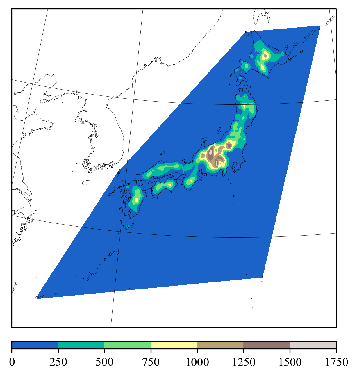
def draw_on_synoptic_chart():
import matplotlib.pyplot as plt
fig = plt.figure(figsize=(105/25.4,105.2/25.4),dpi=300) # figsizeはinch指定なのでmm/25.4する
ax, proj, proj_cart = draw_japan_map((0.05,0.05,0.90,0.90),[122,148,23,46])
nland = 1311
lon, lat, zs = np.memmap("topo.example.bin",dtype="f4",mode="r",shape=(3,nland))
C=ax.tricontourf(lon,lat,zs,cmap="terrain",transform=proj_cart)
plt.colorbar(C,cax=plt.axes((0.05,0.0,0.90,0.02)),orientation="horizontal")
fig.savefig("synoptic_chart_on.png",bbox_inches="tight",pad_inches=0.1)
return
draw_on_synoptic_chart()
完成した図はこのような感じです。
(5) 図の「座標変換」。
def convert_fig_xy():  # 日付軸とY軸で構成される図のfigure座標、pixel座標、日付・Y座標の変換
    import numpy as np
    import datetime as dt
    import matplotlib.pyplot as plt
    x = np.array([dt.datetime(1970,1,1,0)+dt.timedelta(days=i) for i in range(20)])
    y = np.linspace(20,60,20)
    fig = plt.figure(figsize=(5.5,3),dpi=300) # 300px/inchなので、X=5.5x300=1650px, Y=3x300=900pxのpixel座標となる。
    ax = plt.axes((0.1,0.1,0.8,0.8))          # figure座標は常に[0,1]x[0,1]
    ax.set_xlim([x[0],x[-1]])                 # 距離座標のX軸は日付軸にする
    ax.set_ylim([y[0],y[-1]])                 # 距離座標のY軸は緯度軸にする
    p_on_fig = (0.5,0.5)
    p_on_pix = ax.transAxes.transform(p_on_fig)            # figure座標-->pixel座標
    p_on_dis = ax.transData.inverted().transform(p_on_pix) # pixel座標-->距離座標

    print(p_on_fig)
    print(p_on_pix)
    print(p_on_dis)
    print(dt.datetime.utcfromtimestamp(p_on_dis[0]*86400))  # utcfromtimestampで1970.1.1 00Zからの秒数から日付を返す

    dt_aware = dt.datetime(1970, 1, 11, 0, tzinfo=dt.timezone.utc)  # 1970.1.1 00Zからの秒数を返す
    p_on_dis = (dt_aware.timestamp()/86400,35.0)
    p_on_pix = ax.transData.transform(p_on_dis)            # pixel座標 <-- 距離座標
    p_on_fig = ax.transAxes.inverted().transform(p_on_pix) # figure座標 <-- pixel座標

    print(p_on_dis)
    print(p_on_pix)
    print(p_on_fig)

    return
convert_fig_xy()
以下は出力。
(0.5, 0.5)
[825. 450.]
[ 9.5 40. ]
1970-01-10 12:00:00
[0.52631579 0.375     ]
[859.73684211 360.        ]
(10.0, 35.0)
Ⅳ.国土数値情報の描画
国土数値情報にある道路・河川・市町村境界などを描く方法です。(1)都道府県、支庁(北海道)、市町村境界
shapefileをimportして、.shpの拡張子のファイルをshapefile.Readerで読み込みます。
そのリスト数は下記プログラムの例だとlen(src)でわかります。このプログラムでは北海道の旧支庁数14をもとに、その境界を記録します。
src.record(番号)には、都道府県名、支庁名、市町村名などの情報が記録されています。
国土数値情報の解説ページを参照すると
["都道府県名","支庁名","政令指定都市名・郡名","市区町村名","行政区域コード"]であることがわかります。
次に、src.shape(番号).pointsにより経度、緯度の情報を取り出します。
下記のプログラムでは北海道の行政区画のshapeファイルから緯度経度を取り出しています。その際、飛び地への一筆書きを避けるために、ある一定距離離れたら、筆を離すようにリストで分割しています。
def shape_branches(shpfile):
    import numpy as np
    import shapefile     # !pip3 install shapefile --userでインストールしてください
    import cartopy.crs as ccrs

    src = shapefile.Reader(shpfile,encoding="SHIFT-JIS")

    for nb in range(1,15):

        rec = src.record(nb)
        shp = src.shape(nb)
        print(rec)
        Lons, Lats = [], []
        lons, lats = [], []
        dists = []
        for p1, p2 in zip(shp.points[:-1],shp.points[1:]):
            dist = np.sqrt((p2[0]-p1[0])**2+(p2[1]-p1[1])**2)
            lons.append(p1[0])
            lats.append(p1[1])
            if dist > 0.04:
                Lons.append(lons)
                Lats.append(lats)
                lons, lats = [], []

        Lons.append(lons)
        Lats.append(lats)

        np.save("{:02d}.npy".format(nb), [Lons,Lats], allow_pickle=True)

    return
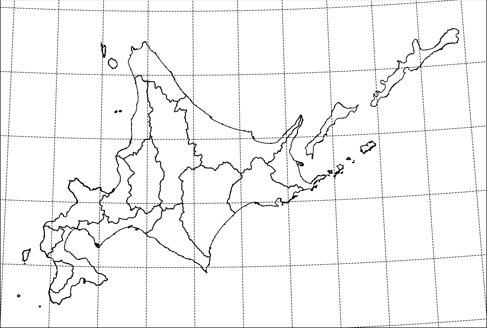
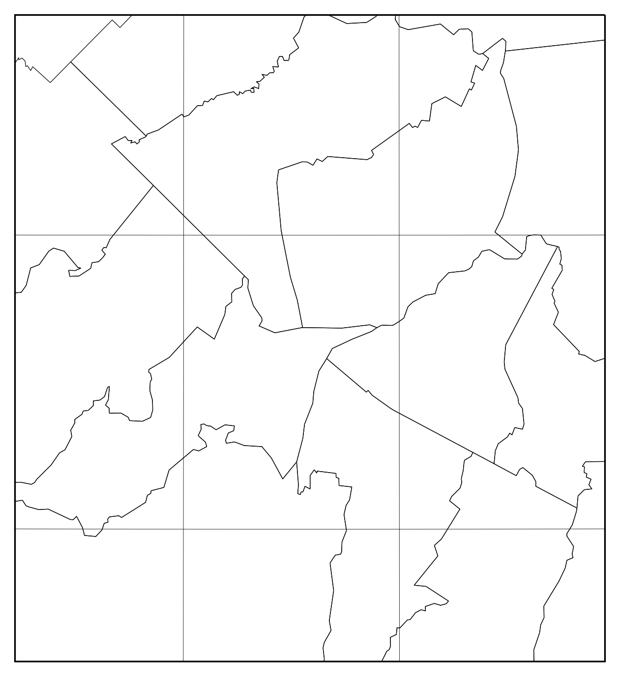
上記で作成した緯度経度ファイルを利用して北海道支庁境界を描くと下記の通りとなります。
def draw_map():
    import numpy as np
    import matplotlib.pyplot as plt
    import matplotlib.ticker as mticker
    import cartopy.crs as ccrs
    import cartopy.feature as cfeature

    fig = plt.figure(figsize=(5,5),dpi=200)
    lonll, lonur, latll, latur = 139, 149, 41, 46
    lonc, latc, lat1, lat2 = 142.5, 42.5, 30.0, 60.0
    proj = ccrs.LambertConformal( central_longitude = lonc,
                                 central_latitude = latc,
                                 standard_parallels = (lat1, lat2) )
    proj_cart = ccrs.PlateCarree()

    ax = plt.axes((0,0,1,1),projection=proj)
    ax.set_extent([lonll,lonur,latll,latur])

    g1 = ax.gridlines(crs=ccrs.PlateCarree(), linewidth=0.4,color="k",linestyle="--")
    g1.xlocator = mticker.FixedLocator(np.arange(lonll, lonur+1,1))
    g1.ylocator = mticker.FixedLocator(np.arange(latll, latur+1,1))

    for ib in range(1,15):
        [Lons,Lats] = np.load("{:02d}.npy".format(ib), allow_pickle=True)
        for lons, lats in zip(Lons,Lats):
            ax.plot(lons,lats,color="k",lw=0.5,transform=proj_cart)

    fig.savefig("Hokkaido_branch.png",bbox_inches="tight",pad_inches=0)

    return

draw_map()